Lena Yokoyama
Lena Yokoyama is a Japanese/Austrian illustrator and printmaker and ‘visual translator’ based in London. Her illustrations are playful and optimistic and like to feature an array of quirky characters in different shapes and sizes with lots of colour and texture. She works with a combination of traditional and digital tools, including ink, Riso, lino and pixels. As a result, her work retains a lot of the natural and hand-made aspects of mark-making and analogue print techniques. She loves grain, imperfections and misregistration. The themes in her work are connected to social values, cultural identity, and cross-cultural communication. She cares about community, highlighting diversity and using Illustration to create bridges between different cultures. Instagram: @lena_yokoyama

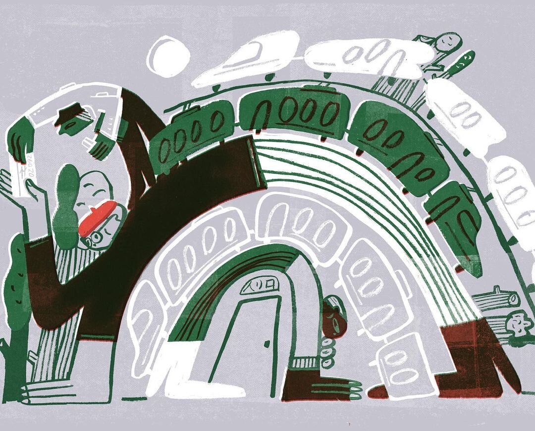
‘Visual Translations’.
As someone from a multi-cultural and multi-linguistic background, with my dad being a translator of Japanese and my mum being a German language teacher, translation has always played a role in my life. However, as I’m a visual artist who likes to communicate with images much more than with words, I’m looking at how translation may be performed visually, in a way that can go beyond what words can express.
My project explores the Japanese concept ‘Ma’ 間, which loosely means ‘pause’ or ‘in-betweenness’, yet the finer nuances of its meaning cannot easily be contained in the English language. My aim is to instead use an illustrative language that will allow this concept to become accessible to a wider audience.

The project is similar to the game of Silent Post/Telephone/Chinese Whispers. I asked my Japanese dad to take an old point and shoot camera to Japan and take pictures of scenes he would consider to represent ‘Ma’ 間. I then asked him to describe the basic composition of these images to me without showing me the photographs. My illustrations are my further interpretation of his descriptions.
This creates a chain of reiterations of information and acts as an experiment to see whether meaning can be carried through different mediums, thus creating visual forms of translation. I understand that the association of meaning is a highly subjective matter, however, this project is an experiment to see whether visual language can render nuances that words may not. ‘Visual Translations’ is therefore an investigation into the capacity of translation as much as it is a process of learning about my cultural heritage through drawing.
My work is painted using Japanese calligraphy ink on paper and later digitally coloured. Each of the illustrations consist of a limited colour palette with only 2-3 layers. Often using complementary colours, I create additional colours by overlapping my layers without having to add more. It creates a kind of ‘faux-riso’ effect. I’ve developed my illustration process specifically in this way so that my work can be further translated into spot-colour printing, through my own Risograph (Roko Press). My love for Riso is largely connected to my love for grain, imperfections and misregistration.